Andrew Kuo Feels Through the Uncertainties in ‘Attachments’
The exhibition is on view at the SCAD Museum of Art until January 1, 2027.
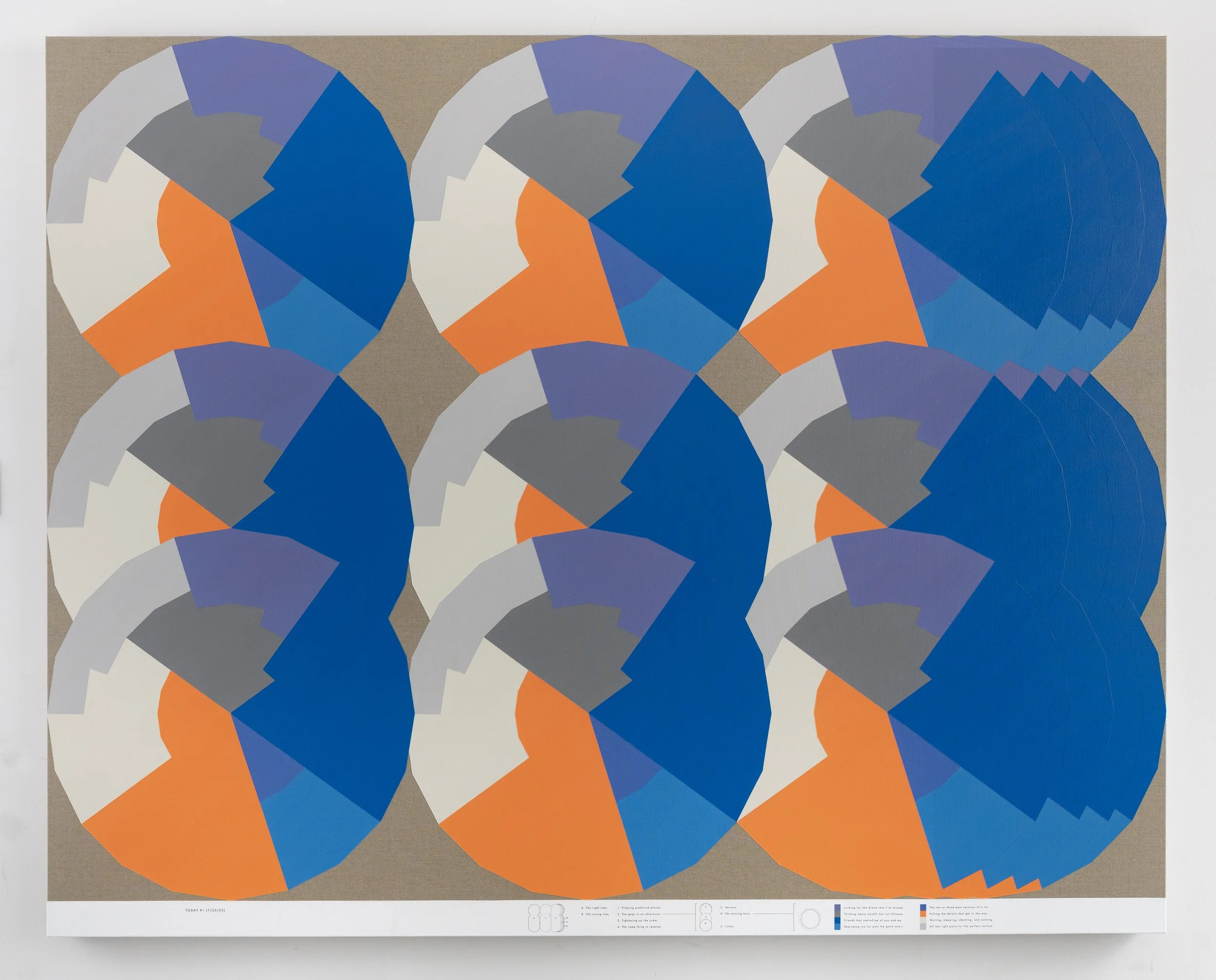
Photo Courtesy of Andrew Kuo and Broadway Gallery
Andrew Kuo is a very sentimental person. Born in Queens, New York, the multidisciplinary artist invites viewers to examine, communicate with, relate to, and react to his artwork. During the COVID-19 pandemic, Kuo’s fear of uncertainty changed his outlook on his own sense of self, relationships, and the world around him–leading him to create years-long pieces, such as his latest exhibition, Attachments.
On view at the SCAD Museum of Art until January 1, 2027, Kuo’s Attachments presents a juxtaposed, yet cohesive body of work. They include his letterhead paintings with abstract, unstructured, colorful brushstrokes. In contrast, his chart paintings convey complex, data-like details that depict optical illusions of his interests, emotions, and journeys as he navigates life.
Kuo also incorporates LED screens of moving bodega flowers that mimic Monet’s water lilies. During the pandemic, Kuo pondered the idea of an Asian garden in France. He felt it may be some of his last moments to look at, feel, and experience nature, and the bodega was his safe haven and dependable place to always access those flowers.
Kuo spoke with 1202 MAGAZINE about how Attachments came to life, what emotions, challenges, and epiphanies he experienced while making the body of work, and how he wanted to convey the messages throughout each piece in an accessible way.
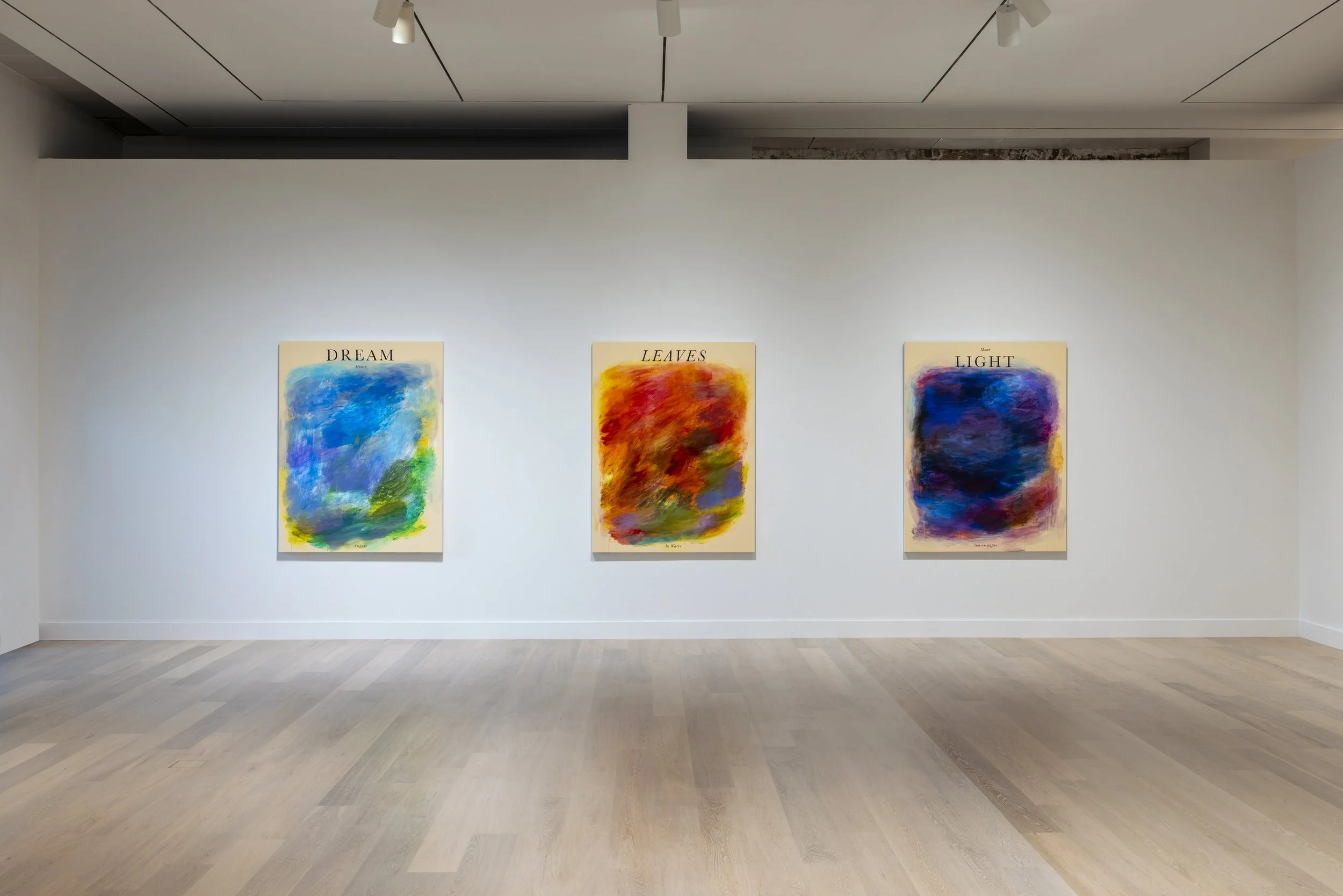
Photo Courtesy of Andrew Kuo and Broadway Gallery
How did the concept and vision for Attachments become a reality on the canvases?
I had been making these chart paintings for years, perhaps decades, and I’d been making these abstract letterhead paintings for a few years afterward. This came about out of a long friendship with Daniel Palmer. We have been talking about showing the art and collaborating on projects for a long time. He suggested that we conceptualize a grouping of these works, and that’s how it came together.
The chart paintings are very complex and data-driven, whereas the letterhead paintings are more abstract. How did you choose the colors, techniques, and materials in the subject matter and forms?
The materials are very specific. The charts are on Belgian linen. They are a little wink to my painting past. I really believe in the affordability and usability of acrylic paint; I think it’s very important to use. These ‘messy’ [letterhead] paintings have a little bit of oil in them, because you can’t beat the tones. The bottom of the chart paintings are carbon transferred; a technique that takes forever and doesn’t always work well. It required a lot of tape and blow dryers.
Among these paintings, did the chart or letterhead paintings come first, and did you map out the charts first, or begin painting first?
I have a little book where I write static sentences; something you might text your friend or write in a book or magazine. Now, they’re floating away like a wink to poetry. They’re less specific than they used to be. I had so many words in my mind and had been making these for so long, and I wanted to know what kind of form I wanted them to take.
Everything happened simultaneously. When I first started, I said, ‘These are the rules. I’m going to see what it looks like, and if it didn’t look good, I would reorganize the rules to make it a painting I would be happy with.’ That was very satisfying and possibly what most of this work is about because it’s structured in a way that is almost figurative. Everything on the bottom of the chart paintings maps out what’s happening in the top portion of the paintings.
How many years would you say it took to complete these bodies of work, and how have they shown your evolution over time?
When I began, I paid homage to abstract minimalists like Josef Albers, Barnett Newman, and Ellsworth Kelly. The paintings ended up expanding and exploding a little bit, and then I stopped referencing art. I let them take over themselves. There are various degrees of density; sometimes they are very complicated, and sometimes they aren’t, but they have taken on a rhythm as I worked on them more and more. Although they changed a lot, the pieces in this show represent more complicated thoughts.
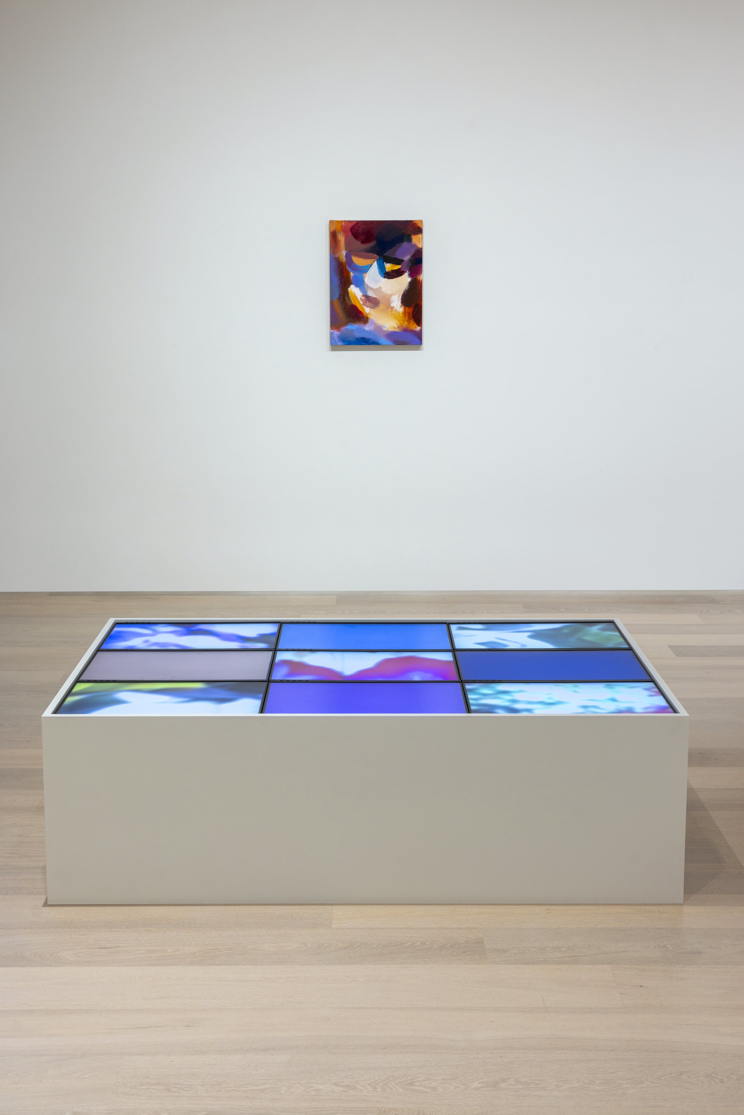
Photo Courtesy of Andrew Kuo and Broadway Gallery
As you move through the LED screens, each screen merges into the next object and color. How does this work, and what does it represent?
There are five panels of blurry abstractions; those are bodega flowers in New York City. The other four squares are sourced from the colors of the five flower squares. They also mimic Monet’s water lilies. I started making these during the pandemic lockdown, and, being Asian and with that garden being Japanese, I thought about what he might project onto an Asian garden in France.
I thought, ‘If these are the last days we have, I need to look at nature,’ and my bodega was the only place I could find beautiful flowers. Obviously, there are parks, but I wanted to see more colors. In front of the LED screens is also my blurry self-portrait. It’s blurry as if I’d taken off my glasses, because I’m nearsighted. This portrait is an extrapolation, because all you can see clearly in the painting are the glasses, and not a face.
How did you animate the flowers on the LED screens?
These were photographs that I then took videos of. I put them up on my computer screen and scanned them. I liked the idea of looking through multiple lenses and seeing a garden, rather than a full view.
What challenges or hardships did you encounter while creating Attachments?
How to say something cohesively. I’m very aware this is teaching museum, and it’s important to convey many ideas while having them be accessible. That was the challenge for this collection of works. They can seem so disparate and complicated, but I want a bit of it to wash over the viewer. I want there to be enough to think about after they leave the room.
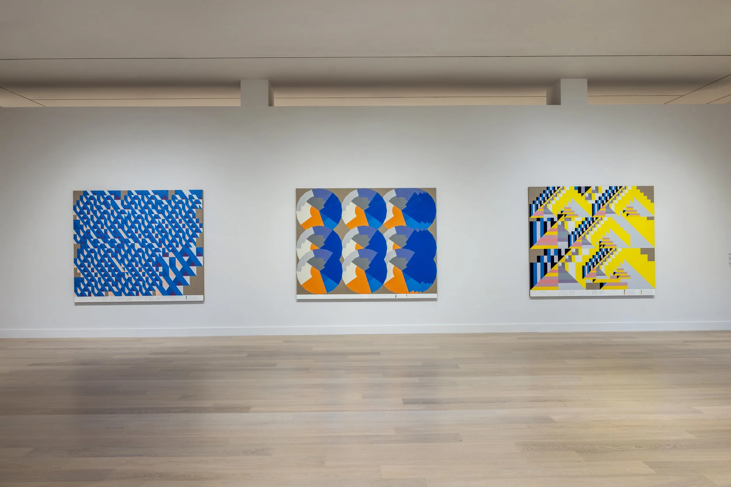
Photo Courtesy of Andrew Kuo and Broadway Gallery
I see many shapes within shapes throughout the chart paintings. What are you looking to convey to the viewer?
I ask the viewer for a little assistance. You have to suspend your disbelief a bit, because the flatness is important. That’s what makes it interesting to me. At first, I started cutting out shapes from paper and layering them, continuously trying to figure it out.
The computer is perfect for this. It’s symmetry, cut and paste. It’s awesome because when you think about a sunset, the slowness of a clock, and then the fastness of the abstract expressionist—it’s so interesting how the quick act of painting is such a meaningful storytelling device.
What do the words represent in the letterhead paintings?
They are deeper investigations of the text on the charts. The themes are so broad that they float away. They are thoughts of mine. I remember the original working title of this show was Sentimental Paintings. We changed it to Attachments as a wink to the time period. These are expressions of something more raw.
If you look at a solid color in one of the chart paintings, it starts to reveal itself: ‘There’s another color under here,’ or ‘The brushstrokes aren’t lining up.’ That is the further investigation of that. I use my hands, and I try to get to the bottom of something more emotionally present.
Do you think the concept of Attachments will continue in future bodies of work, or were these fleeting moments and emotions?
There are many ways artists approach this. To me, they’re one continuous timeline; I enjoy artists who make things over and over. Artists who have done that in the past are big inspirations to me. This will keep going on until I decide to change it, which feels like it will be soon. It feels like there will be another shift.